.jpg)
Image courtesy of Wikipedia
.jpg)
Mobile Friendly Paging
Simplicity and Flexibility On A Small Screen
Web browsing on a mobile phone can sometimes feel spartan. There is not much room for extra info and getting it to line up and display nicely is not easy.
One small and overlooked item has become a staple on most web sites - paging data. Whether you are searching or just going through content paging is one of the most common means of providing manageable chunks to scroll through.
However, most paging felt lacking and limiting. You are either restricted to "next-ing" 20 times to get where you want or you keep "next-ing" and wonder how far until it ends. Either experience can be frustrating for users so I wanted to take a stab a designing something that would address the above concerns.
Lets take look at how a few sites implement mobile paging and then see what how my design compares.
Demo
If you can't wait and want to see what I came up with then you can try out the demo and come back to see the reasoning behind it.
Pages and Pages of Quirky Pagers
Let's take a look at a few pagers on some popular sites and see how it shows up on my mobile device.
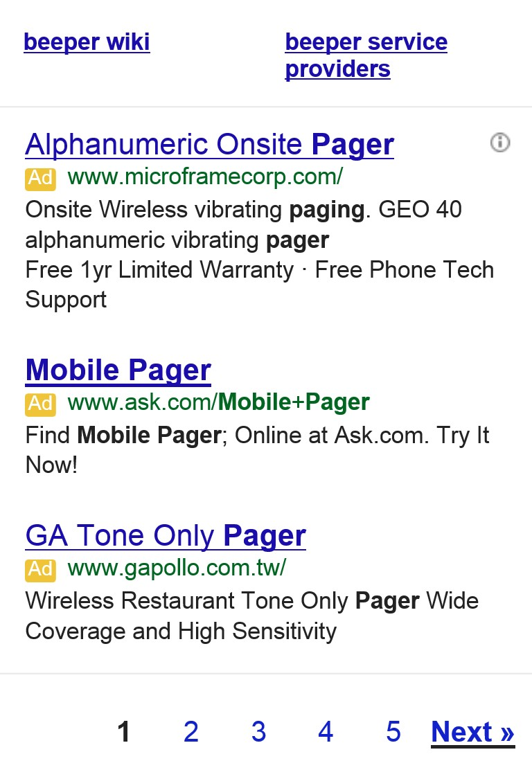
Let's take a look at three examples of paging data and see what we find.

Design Notes:
- The next or previous button are hidden when they don't apply
- Provides some page numbers to allow non-sequential access to the x pages near the current page
- Links are straghtforward although smaller target to hit on mobile
- Indicates current page
- No indication of how many pages left
- Previous and Next are aligned left and right respectively

Design Notes:
- The next or previous button are hidden when they don't apply
- Buttons are relatively small sized making them smaller targets to hit
- No indication of what page we are on
- No indication of how many pages left
- Previous and Next are aligned left and right respectively
InfoQ
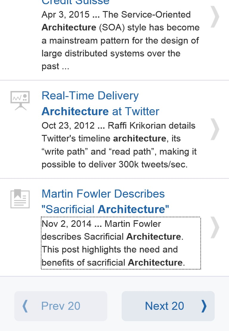
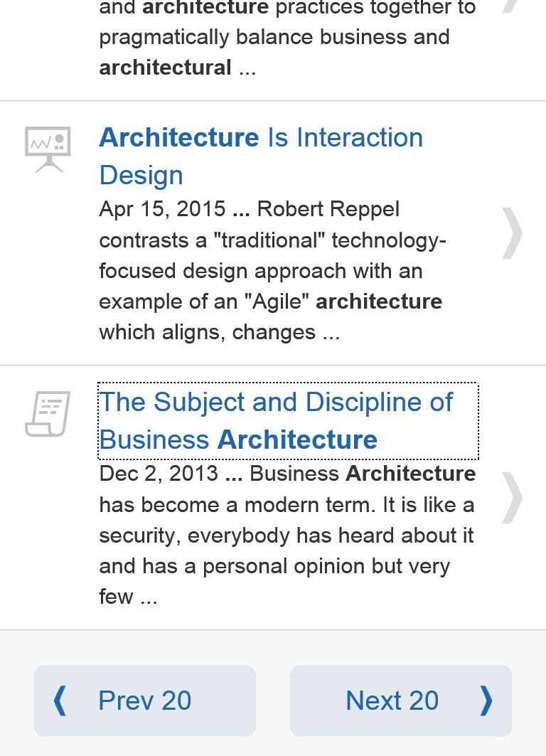
Design Notes:
- The next or previous button are shown as disabled when they don't apply
- Buttons are nice large targets for mobile
- No indication of what page we are on
- No indication of how many pages left
- Indicates how many items per page
- Previous and Next are aligned left and right respectively
What I Came Up With
Here's what I set out to accomplish with my design:
- Indicate how much content is remaining
- Indicate how much content I have seen
- Buttons should be nice large targets for mobile
- Indicate what page we are on
- Previous and Next are aligned left and right respectively
- Be able to navigate non-sequentially
Starting Out
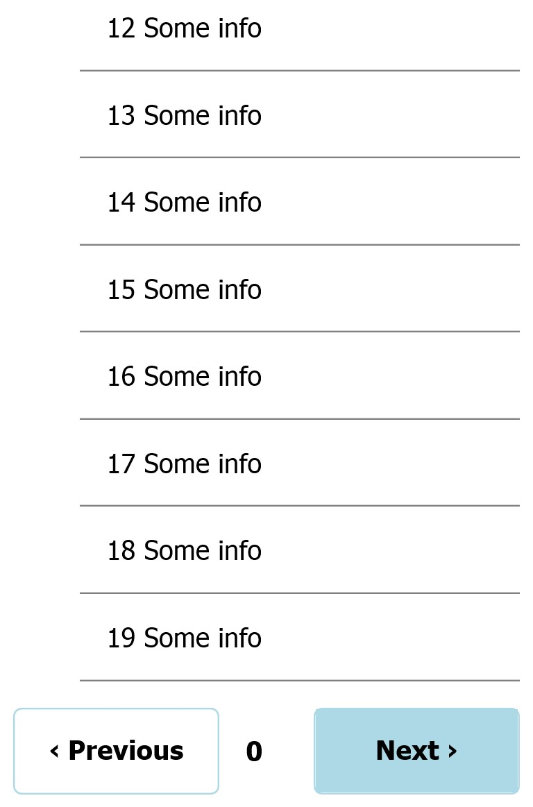
When we are on the first page we haven't seen any content yet so only the next button is filled. Right now we sort of look like the InfoQ example and the user might just think the previous button is disabled and the next button is the active primary.
Next Page Please
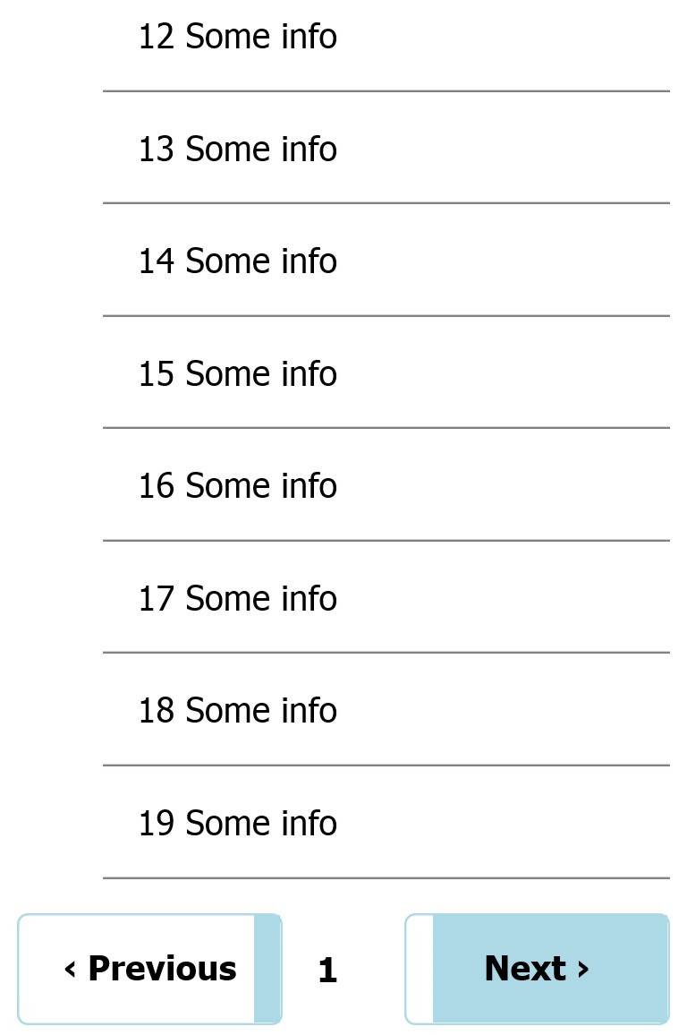
Now that we are a page in we have seen a certain portion of the available content. The previous button now represents the amount of content we have seen while the next button shows the remaining amount. This gives the user a sense of space and let's them know where they are in the content.
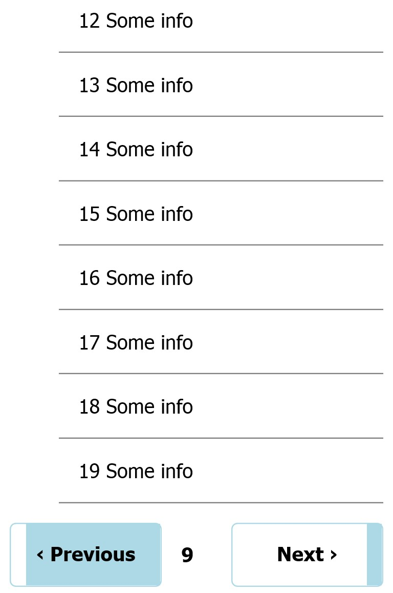
Halfway There
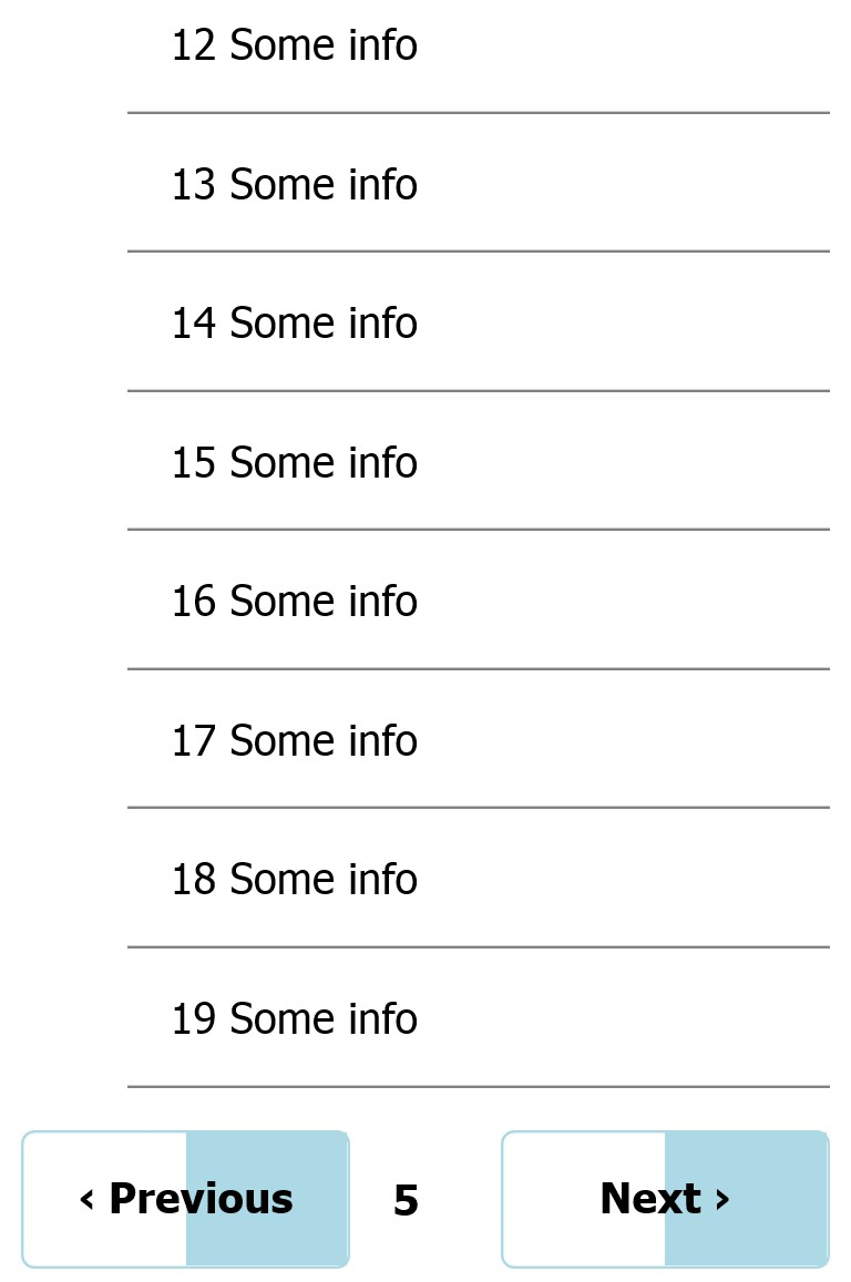
Hooray, we have seen half the content and the next and previous buttons graphically represent it.
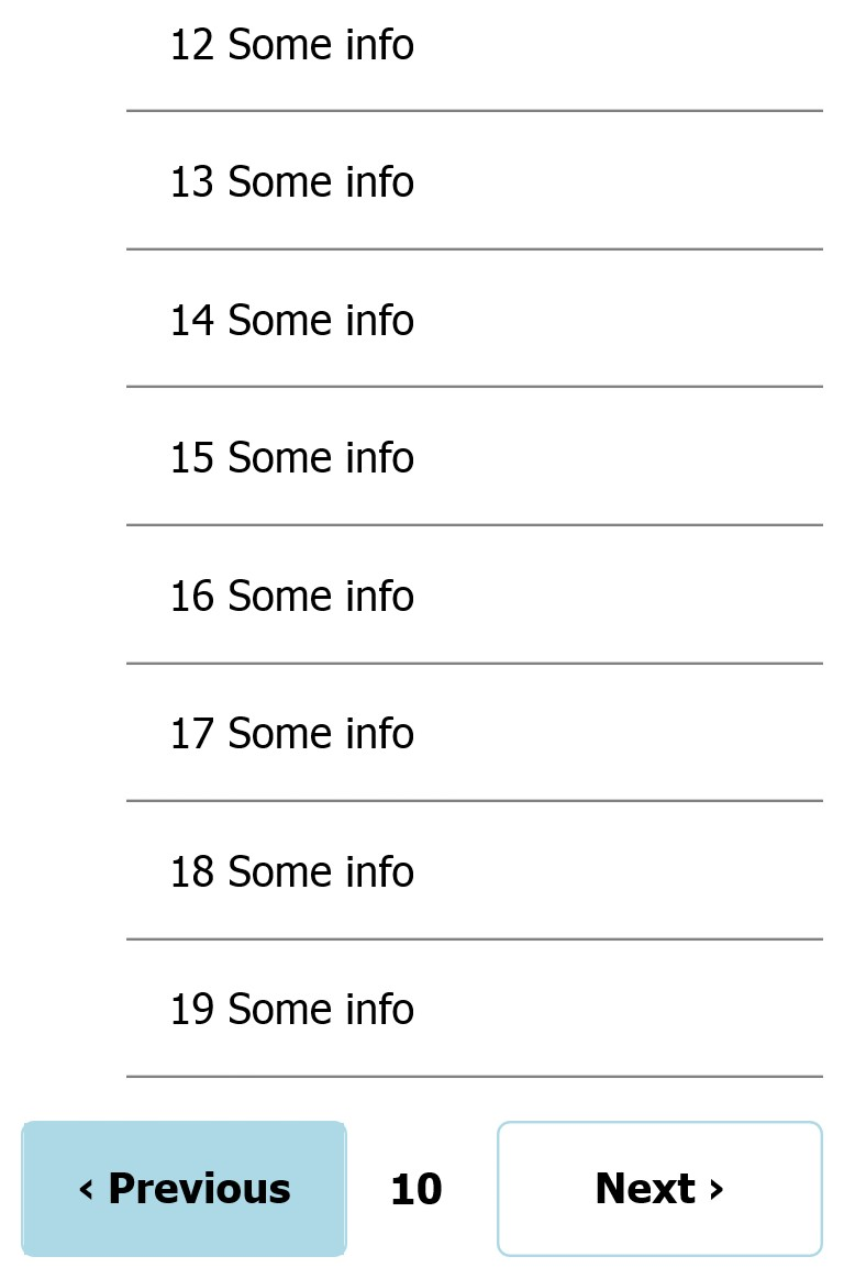
Jump Around
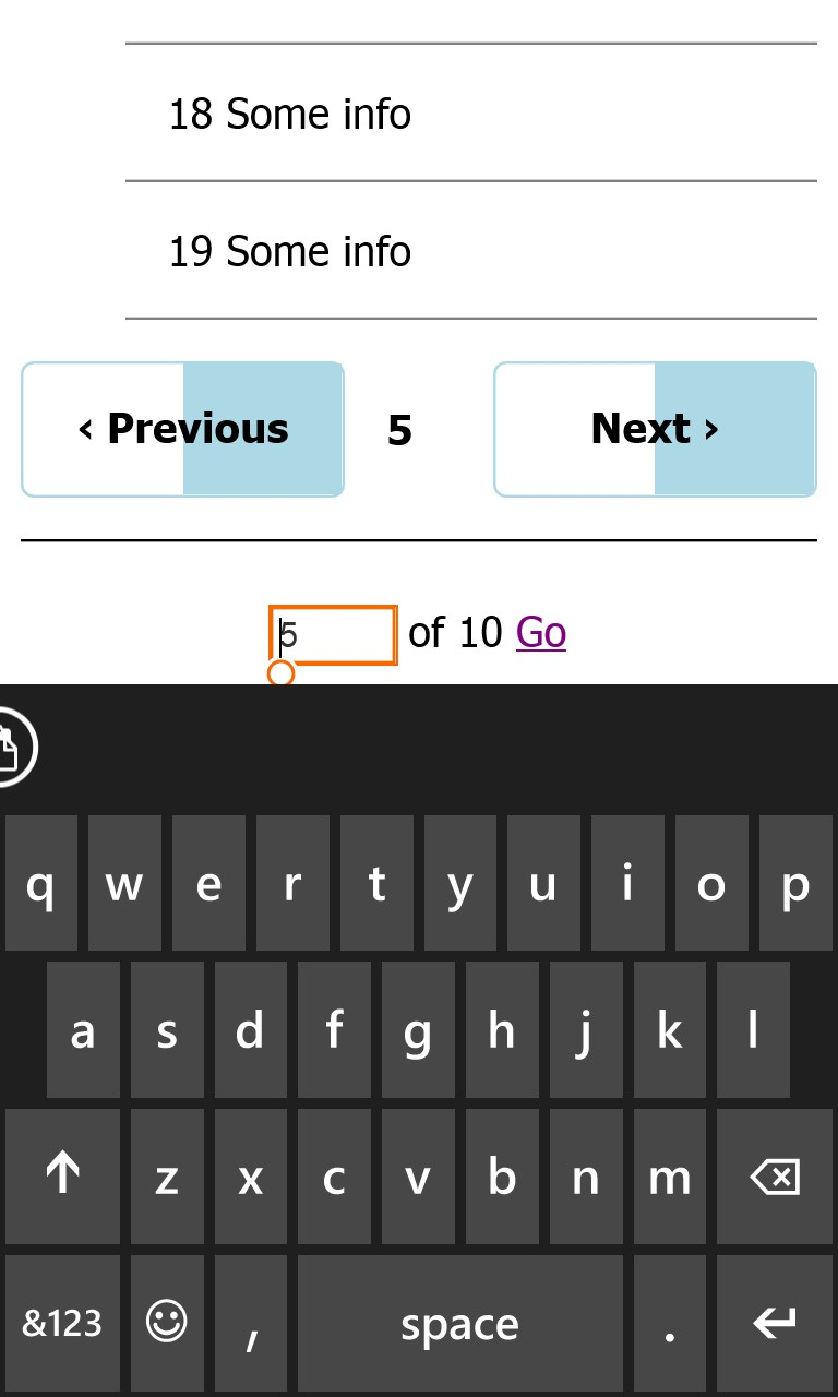
Maybe we want to pick up where we left off or we want to skip towards the end. We can support all sorts of requests by letting the user enter which page they want by clicking on the current page in between the previous and next.
The End Is In Sight
We are on the next to last page and can easily see how far we have come. Much like a gas gauge or other familiar representation we can see that the next button is almost "empty".
Endings Are Another Beginning
Congratulations, we finally saw all the content. The next button now looks disabled since there is no more content.
Wrapup
While this solution may not be the best fit for all cases in the cases it does fit it can provide context to the user while paging through data. It can be used when walking through a wizard-like interface to graphically show what portion of the steps are remaining versus completed or it could be used in an ebook or other written content to visually indicate progress in a chapter.
The design achieves the original goals and in the end is pretty simple to implement either on the client side or server side.
Try and out and let me know what you think.